Best of the
Best
Editors' picks and our top buying guides


Best of the
Best
Editors' picks and our top buying guides
Latest

How to Use a VPN: Everything You Need to Know
7 minutes ago
Upgrade to This Huge Samsung OLED TV Now, Yours for an All-Time Low Price
9 minutes ago
AirPods May Hold the Key to Apple's Big Health Bets
21 minutes ago
Wild Weather Ahead: Summer 2024 Could Be a Scorcher After Hottest Year on Record
22 minutes ago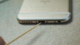
Phone Won't Charge? This Easy Trick Might Fix It and Save You Money
22 minutes agoWhat AirPods Rumors Tell Us About Apple's Health Ambitions
08:18 • 22 minutes ago
Google I/O: Everything to Expect, From the Pixel 8A to Android 15
22 minutes ago
Even Apple's Cheapest iPhone SE Can Take Great Photos With These Pro Tips
22 minutes ago
This Houseplant Cleans Air 30 Times Better Than a Typical Plant
24 minutes ago
Save on Your Next Trip With These Travel Coupon Deals
27 minutes ago
Music to Your Ears: Save Up to $50 Off Apple HomePod Smart Speakers
1 hour ago
What is Shrinkflation? Everything to Know About This Sneaky Cost Increase
1 hour ago
Xbox Game Pass Ultimate Lets You Play Jedi: Survivor and Manor Lords Now, More Soon
1 hour ago
How to Watch 'Knuckles': Stream the Sonic the Hedgehog Spinoff Show From Anywhere
1 hour ago
Best Buy Sale Knocks $100 Off Apple Watch Series 9 in Various Colors and Sizes
1 hour agoMore to Explore
Reviews, advice and more from CNET's experts.


Get the best price on everything CNET Shopping helps you get the best prices on your favorite products. Get promo codes and discounts with a single click.
Add to Chrome - it's free!
Our Expertise
Expertise Lindsey Turrentine is executive vice president for content and audience. She has helped shape digital media since digital media was born.
0357911176
02468104
024681024
Featured in
Tech


Upgrade your inbox
Get CNET Insider
From talking fridges to iPhones, our experts are here to help make the world a little less complicated.
Featured in
Money


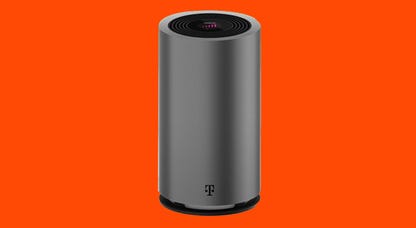
Crossing the Broadband Divide
Millions of Americans lack access to high-speed internet. Here's how to fix that.


Featured in
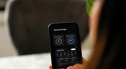
Energy and Utilities


Deep Dives
Immerse yourself in our in-depth stories.


Get the best price on everything CNET Shopping helps you get the best prices on your favorite products. Get promo codes and discounts with a single click.
Add to Chrome - it's free!
Featured in
Internet


Sleep Through the Night
Get the best sleep of your life with our expert tips.


Get the best price on everything CNET Shopping helps you get the best prices on your favorite products. Get promo codes and discounts with a single click.
Add to Chrome - it's free!
Tech Tips
Get the most out of your phone with this expert advice.


Get the best price on everything CNET Shopping helps you get the best prices on your favorite products. Get promo codes and discounts with a single click.
Add to Chrome - it's free!

Featured in
Home


Living Off Grid
CNET's Eric Mack has lived off the grid for over three years. Here's what he learned.