Safari 4 a big step up, but not as far as rivals
The beta of Apple's new browser catches up to rivals in interface and performance. But how can an overhaul still be missing an extensions framework?


- Shankland covered the tech industry for more than 25 years and was a science writer for five years before that. He has deep expertise in microprocessors, digital photography, computer hardware and software, internet standards, web technology, and more.
With Safari 3, I admired Apple's chutzpah for bringing its browser to Windows. With the new Safari 4 beta, I'm actually starting to admire the browser, too.
A big user interface overhaul makes Safari look polished rather than clunky on Windows, builds in better search abilities, and makes good use of the fact that people often visit the same sites over and over.
However, the lack of something like the extensions architecture that Firefox pioneered still means Safari 4 (download for Windows and Mac OS X) is better only than Safari 3, not the competition.

The new software puts Safari 3's brushed-metal appearance on the scrap heap and bolts on a Windows-native appearance. I'm not one of those user interface conformists, but I found the brushed metal interface downright ugly on Windows, in part because of the blotchy font rendering.
Safari 4, though, generally looks slick. And I like its user interface, too, which through what appears to be a case of convergent evolution shares a lot with Google Chrome and some of Firefox's as well.
There's plenty of other new material, though, and Safari's snappy performance makes it a viable contender in the browser wars. Competition really is making the browser better, which is of immense importance as the computing industry moves to a cloud-computing future where applications run on the Web as well as on personal computers.
It's still curious that Apple thinks it's worthwhile to bring Safari to Windows. The company's high-end software, such as Aperture and Final Cut Pro, work only on Mac OS X. Very mainstream software such as iTunes and QuickTime work on Windows, too. iPhoto and other iLife programs in an intermediate realm only work on Mac OS X, though, indicating that Apple has limited appetite for the hassles of supporting a rival operating system.
I suspect that Apple concluded Safari for Windows could help the company tout its wares, possibly convincing Windows users that Apple has some software skills. And perhaps it's laying the groundwork for tighter integration with other Apple software, hardware, and Web services.
For a beta, the software is workable; I encountered one crash in a couple of hours' use.
User interface improvements
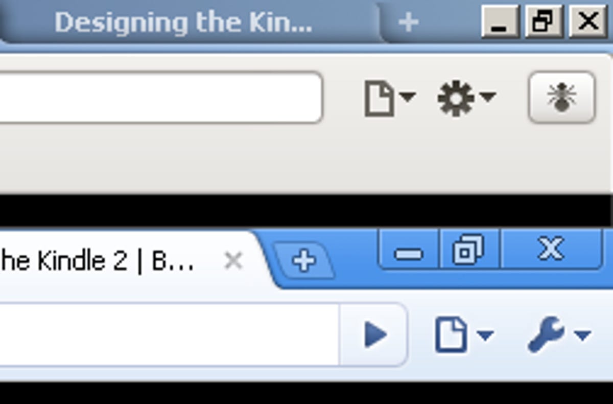
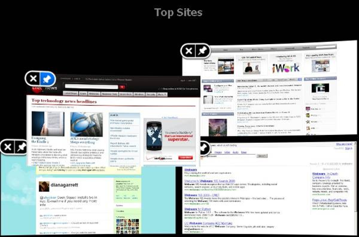
Like Chrome, Safari 4 puts all its tabs across the top of the screen, with no traditional title bar, with the address bar below and a row of bookmarks below that. Even the upper-right mini-menus are similar, with small icons for window management and tools. Also like Chrome, when a new tab or page is opened, Safari 4 will by default show an array of most frequently visited sites, a feature Apple calls Top Sites.
Those differences compared to regular browsers are subtle, but I got used to them in Chrome and concluded I like them. Safari has some differences, though.
For one thing, I'm a keyboard shortcut user, and Safari grants me access to its menu items by hitting the Alt key, which is standard Windows protocol but which is missing from Chrome. For another, Top Sites is much more sophisticated, not just because it has a fancy 3D view, but because you can choose how many mini-pages to show, move them around, "pin" the ones you like to a fixed position, and delete ones you don't want showing.
I like showing tabs at the top, which I think devotes proper prominence to the multiple browser views. But I have nits: the font is too dim, making it hard to see the tab text, and I don't care for how the tabs sprawl to claim as much real estate as possible, because for me it makes them actually harder to recognize as tabs. Perhaps I'll get used to that in time.
Happily, middle-clicking on a link opens the Web page in a new tab now rather than a new browser window, something that bugged me with Safari 3.
But Safari doesn't do something deeper with tabs that Google did with Chrome, isolate each into its own separate computing process. That isolation improves security and stability, though you pay a price in memory. Once Chrome offered it, I got annoyed when a problem that could have brought down a single misbehaving tab brought down my entire browser.
More eye candy
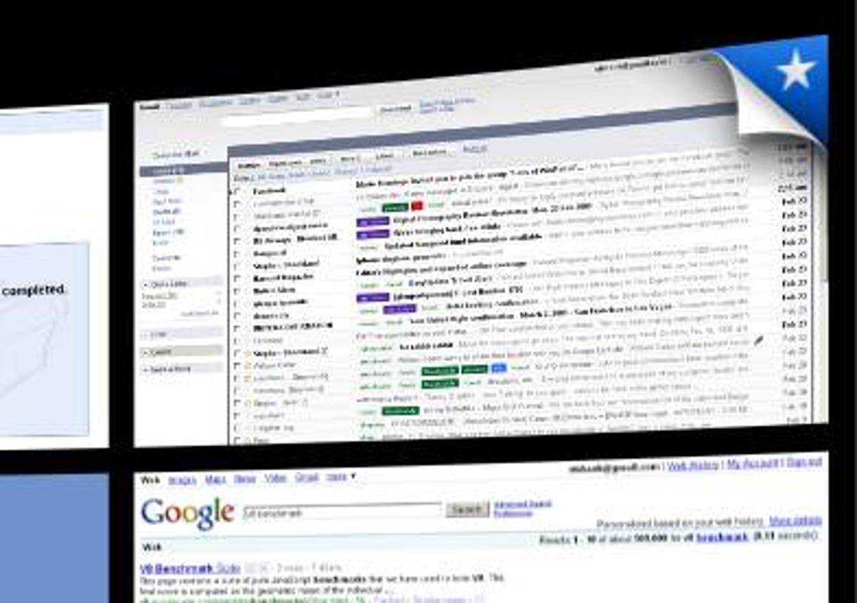
Another example besides Top Sites of Apple's polished user interface is the Cover Flow interface to browser history. I'm not a big user of history, so this looks cosmetic more than useful to me, but if you are going to use it, perhaps the visual images will help you find what you need more rapidly than scanning a list of text. A text search box also helps retrieve information.
More helpful by far is the Smart Address Field, which like Firefox 3's Awesome Bar suggests Web addresses from your history and bookmarks when you start typing. It's a much more effective way of returning to earlier sites than scrolling through text history lists.

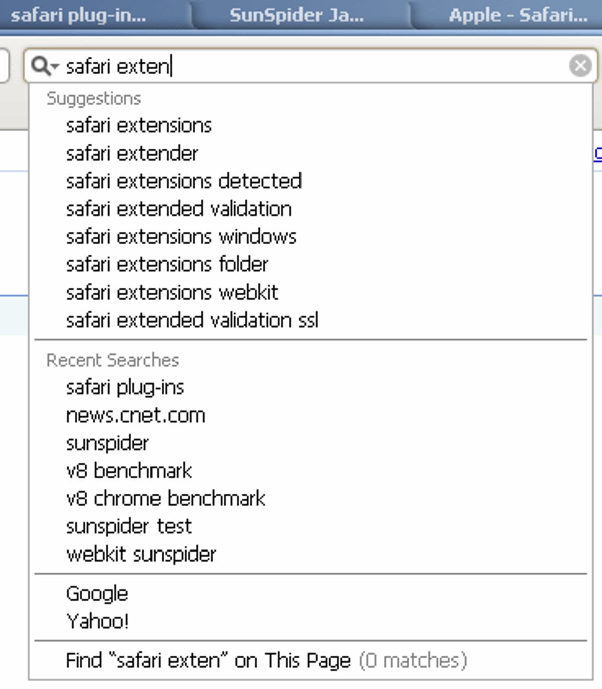
Given Apple's user interface chops, it's interesting the company didn't go as far as Chrome by integrating Web search in the address field. Instead, Safari still has a separate search field to the right of the address bar. Now, though, it's got what Apple calls the Smart Search Field, which is a fancy brand name for using Google Suggest to show possible options when you start typing. Google, Yahoo, and Microsoft all like this feature on their search engines, and I like it this way too: it can save you a few keystrokes, and sometimes it can even help you find material when you don't know exactly how to spell it.
Like rival browsers, Safari now can magnify or shrink the entire Web page--graphics and text--which is nice for those sites with microscopic type or for when you're showing a site to somebody farther away or dealing with a computer with super-tiny pixels. (Of course, such zooming also can reveal how inflexibly designed a Web page is.)
Skin deep?
User interface improvements aren't just superficial changes. People care about appearance, and making things faster and better adapted to actual humans is important. Kudos to Apple for making Safari look and often work better.
On a deeper level, it's good that the Safari 4 beta also offers better performance. Apple makes a variety of boasts with page-loading speed and, by virtue of its new Nitro engine previously known as Webkit's Squirrelfish, faster JavaScript execution. I can confirm the SunSpider JavaScript speed test runs in less than two thirds the time as on Safari 3, a big improvement, and performance likely will increase more once the final version is released. Check back for more coverage today on detailed performance results.
However, while the user interface improvements overall catch Safari up to the competition and in some cases surpass it, the fact that extensions are missing is an egregious oversight given how powerful Mozilla has shown them to be with Firefox. Not only do they improve the user experience and enable many new features, but they're an excellent way to attract developers and users to your browser. Unsupported options such as PimpMySafari aren't likely to match a real add-on ability.