• On TechRepublic: Five super-secret features in Windows 7
October 16, 2008 12:22 PM PDT

iGoogle attacked by giant widgets

by Rafe Needleman

Google's personalized home page, iGoogle, is getting an update Thursday. Widgets on the page can support a new "canvas view," which expands the widget to the full iGoogle window.

The 16 new or updated widgets that Google is currently promoting support this feature. There are more than 40,000 iGoogle widgets available, iGoogle group product manager Jessica Ewing told me.

iGoogle still displays standard, small widgets, but...

Google will not restrict monetization schemes from running in canvas view. Developers can put whatever they want in the pages. In the smaller "home view," Google does not allow advertising or other direct revenue-generating content.

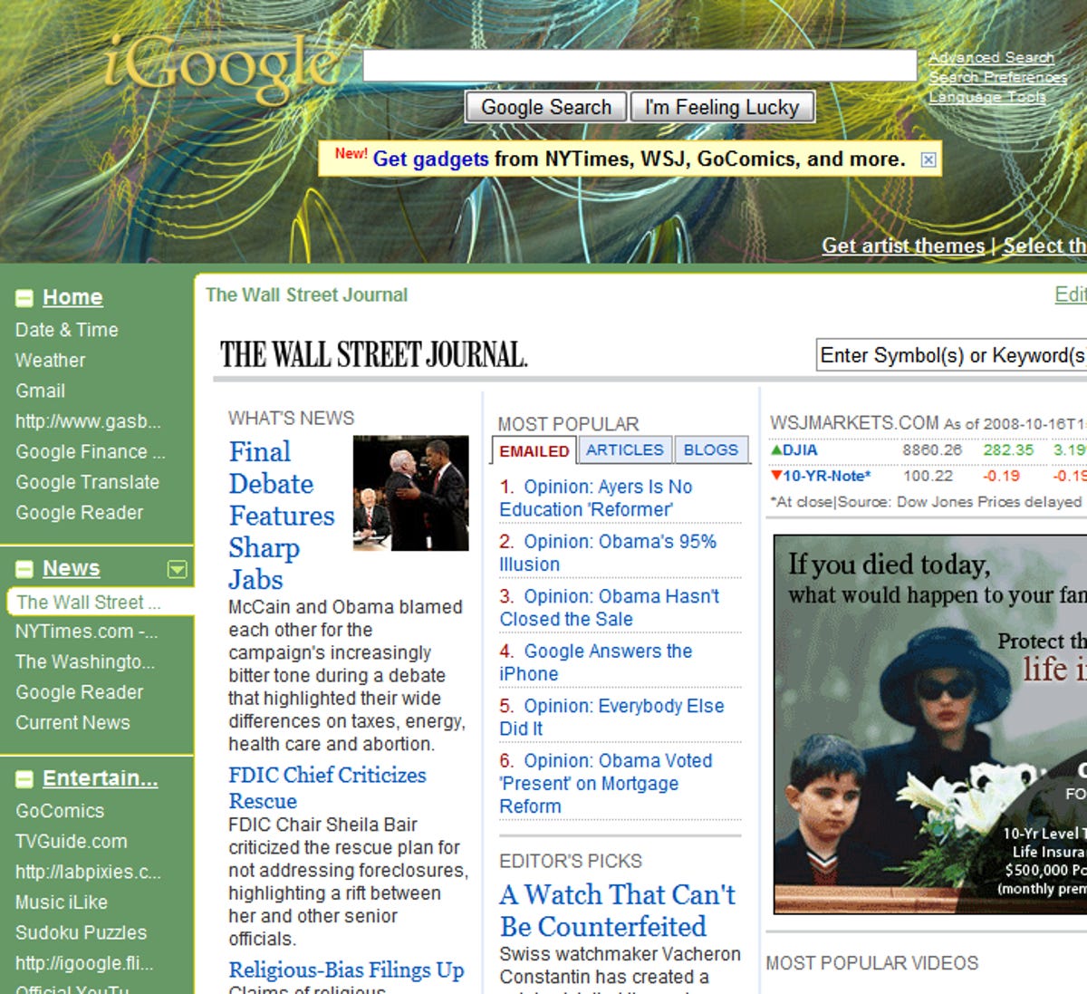
The new iGoogle also moves user navigation from tabs at the top of the page to a bar down the left side. This enables more pages and elements in the navigation, and I found that it made navigating iGoogle faster, since it provided a de facto table of contents for each page.

iGoogle widgets are written in the Open Social platform, so apps created for social networks should run on the new portal page, and vice versa.

Like many of Google's services, iGoogle is platform-aware. On a mobile phone, like on an iPhone or Android phone, when you log in to iGoogle, you'll get a view of your page suited to the constraints of the device. Ewing wouldn't talk about any plans to create a more capable or fluid application specific to mobile platforms.

iGoogle should be rolled out to all U.S. users by the end of Thursday, Ewing said. At the moment, 15 percent to 20 percent of users are on the new platform.

Competitors include My Yahoo, My MSN, Netvibes, and PageFlakes.

In "canvas view," a widget can take up the entire iGoogle display area.

Rafe Needleman writes about start-ups, new technologies, and Web 2.0 products, as editor of CNET's Webware. E-mail Rafe.
Recent posts from Webware
Twitter, LinkedIn team up for self-promotion free-for-all
'Elf Yourself' returns with Facebook and Twitter power
Sneak peek: Xobni e-mail app for BlackBerry
More time needed for revised Google Books deal
With AdMob, Google seeks mobile-ad advantage
Closing chapter of Google Books saga near
Google to acquire AdMob for $750 million
After 5 years, Firefox faces new challenges
Add a Comment (Log in or register) Showing 1 of 3 pages (48 Comments)
by notme321 October 16, 2008 2:48 PM PDT
Shame on google for destroying the best features of I-Google. Complete customization of your home page. The new layout forces tabs onthe left side of the screen and adds a huge amount of deadspace. It seems that a lot of people (myself included) enjoy a simple page with just the stuff they need to use at a quick glance. The left side tabs serve me absolutely no purpose and leaves me with a large empty space on my screen that used to be occupied by things that I actually used.

Google needs to include an option to revert the layout to the previous format. Until then, I will be looking for another home page.
Reply to this comment
by paulherzlich October 16, 2008 3:13 PM PDT
You might try looking on your page settings to see if you can 'restore' your page. Click on the arrow on one of the new tabs at the left. Choose Edit, then go towards the bottom and see if you can find the restore setting. It worked for me, but don't know for how long it will stick.
by wendy.lfm October 19, 2008 1:05 PM PDT
i SO AGREE. i can't believe they made such a drastic change with no option to use the format we like. Has anyone found a home page they like better??
by jfase October 16, 2008 2:53 PM PDT
The canvas view and new gmail gadget are both nice new features but moving the tabs from the top to the left-hand side, without a method to change them back, was a horrible decision. Gadgets now have less room than before and are wrapping because of it. The cons outweigh the pros for me.
Reply to this comment
by FWK13 October 16, 2008 3:03 PM PDT
Yeah, I agree, I really liked how I had my iGoogle homepage set up, I didn't want any changes. Google should have at least given users the option to change it, or keep the way it was.
Reply to this comment
by paulherzlich October 16, 2008 3:11 PM PDT
Bad move. No notice. Just changed, like that. No explanation - except here. Completely distorts my carefully arranged home page. Complete arrogance on Google's part. I was able to 'restore' my home page to earlier today and get back the arrangement I wanted. I wonder how long that will stick. The mentality that would force a change like this onto people is hard to understand. Guess they just want to remind us that they own the real estate. Maybe it will force us to look elsewhere for somewhere less full of children playing in a sandbox.
Reply to this comment
by triscal October 16, 2008 4:02 PM PDT
very cool but how do you get to it?
Reply to this comment
by warpsix October 16, 2008 4:06 PM PDT
How dare you google to just fudge up my settings on igoogle by adding a unmovable tab that takes up 20% of my screen, Don't make me return to hotmail.
Reply to this comment
by jbrojbrojbro October 16, 2008 4:44 PM PDT
At least I could turn off the verbose description of articles. It looks like a tax form. Those left tabs are hidious. I never had that much content. Why are developers so click happy? At least allow horizontal tabs for those of use that did not organize to Googles standard. maybe I'll go back to Yahoo portals.
Reply to this comment
by swissmaine October 16, 2008 4:53 PM PDT
This is nothing short of bizarre. What is going on with Google? (1) the day started with Google having: restarted my computer, signed me out of iGoogle, disallowed yesterday's 20-browser Firefox session to be re-opened, lost yesterday's work, and shoving this new **** left column/tab on iGoogle; (2) this afternoon: despite iGoogle being my homepage, started defaulting to a cruddy new version of gmail--not iGoogle!--despite repeated attempts to return to dashboard with tabs and RSS feeds; (3) this evening a 3rd horrible view of new iGoogle appeared WITHOUT the left column/tab (thank jeebus) but featuring bloated unwieldy expanded RSS summaries - which, when you disable, removes ALL summaries - so it's all or nothing: giant summaries or headlines only.

Meanwhile, gmail is chaos and a total crud experience ---- like the SEND option has been removed from the top of Compose window and requires scrolling to the bottom of email thread to find SEND, and so much more.
Reply to this comment
by gtyron October 16, 2008 5:57 PM PDT
I like what they did with the gmail panel, but I hate the new tabs. The demo picture at the top looks great, but it just doesn't work for me.
Reply to this comment
by garrak October 16, 2008 6:00 PM PDT
Expandable widgets, schmidgets...

The transition to the new iGoogle was so heavy handed and that was very unnecessary.

Does anyone remember the days when Google would hint that a new feature was available and you'd rush to try it because it was cool? Are those days really gone? Such a shame...

Why not add the canvas feature to the original version and leave the position of the tabs as a choice of the user.

The user feedback on this change has been very critical. I, like many, want my old layout back.
Reply to this comment
by Kalvos October 16, 2008 6:02 PM PDT
@jbrojbrojbro: You can turn off the verbose description? Or is that a wish? If you can, how? This is ugly an distracting. I have 28 feeds on the page, which was great when you could see them all. Now it's a cluttered mess. And no way to get rid of that left-hand navigation?
Reply to this comment
by dbjmj October 16, 2008 6:22 PM PDT
I agree with the others. Google has really messed up our home pages. This is a real waste of space. I will be switching to a different home page, such as MSN or charter unless this is changed and changed soon!
Reply to this comment
by gsekse October 16, 2008 6:36 PM PDT
Ok, the new addition on my iGoogle page absolutely sucks. If it remains, I will go back to my excite.com home page that I used for years before Google.
Reply to this comment
by dcullum3 October 16, 2008 7:12 PM PDT
I agree that this was a mistake.. I hate losing the space on my I google page.. Hell, now I have to put on my glasses to read them... Why couldn't they give us a choice?
Right now I am lookinig for alternatives to Igoogle..... Know of any?
Reply to this comment
by markocosic October 16, 2008 7:16 PM PDT
Access the old version by going to the follwing link:

http://www.google.com/ig

Perhaps its time to find a Google doll to sit next to Gates and stuff pins into?
Reply to this comment
by wendy.lfm October 19, 2008 1:29 PM PDT
does NOT WORK!!!!!
by Kaliu3W October 16, 2008 8:45 PM PDT
What idiot thinks its more efficient to have to click on each item rather than scroll down a page(s) that I specifically set up for my needs????? To have it changed without warning, without even giving me a choice to keep what I already had or switch, was really rude. I am angry!! I want my old version back or I will leave this 'New Version' and go elsewhere!!! This layout is totally crappy!!
Reply to this comment
by Kaliu3W October 16, 2008 9:55 PM PDT
OK, after recovering from my initial shock, I went back to my igoogle homepage and figured it out. If you click on the little "x" to the left of the tab heading, then you will have to click on each individual item listed in order to see it. BUT, if you click to the right of the heading, (not on the word itself) your page will appear as it did before. All your gadgets are laid out the way you had them.

It's a little tricky, especially if you have vision problems like I do. If you get too close to the word, it won't let you click. But just a little to the right of the word will work. Hope this helps everybody!! Good Luck!
Reply to this comment
by Tim Brewer October 18, 2008 2:24 PM PDT
" If you click on the little "x" to the left of the tab heading, then you will have to click on each individual item listed in order to see it. BUT, if you click to the right of the heading, (not on the word itself) your page will appear as it did before. All your gadgets are laid out the way you had them."

I don't get it, I can't find the little X to the left of the tab setting on my "new" I-google layout.

"Well, I think I found the fix. Click on the little down arrow on any one of the tabs and choose 'edit this tab'. Down at the bottom is the "show a short description" box. Uncheck it. I did and my iGoogle is back to the way it was."

Tried this and it didn't work for me.

So far the only way to get around this problem is to use a non-USA site such as Canada, Ireland or UK, all of hom still use "old" I-google settings. Maybe Google will introduce a "Classic" I -google setting for users who prefer the old look and feel.
by zinzius October 17, 2008 12:55 AM PDT
use igoogle.ca to revert,apparently only U.S. users are effected
http://www.google.ca/ig
Reply to this comment
by PS1010 October 17, 2008 3:29 AM PDT
The "new" iGoogle - web design from the mid-1990's. Some gadgets do not scale correctly across the page.

Anyone have a recommendation on an alternative to iGoogle.
Reply to this comment
by nsteblay October 17, 2008 4:17 AM PDT
I don't understand why Google couldn't roll this out as a beta to get feedback before dropping it blindly on thousands of people. What did they expect?! Who made this decision? I think we should start calling them Googlesoft.
Reply to this comment
by sanyanet November 22, 2008 2:02 AM PST
"Googlesoft" was just brilliant!!!
Showing 1 of 3 pages (48 Comments)
advertisement

About Webware

Say No to boxed software! The future of applications is online delivery and access. Software is passé. Webware is the new way to get things done.

Add this feed to your online news reader

Webware topics

After 5 years, Firefox faces new challenges

Mozilla helped reshape the Web since releasing Firefox 1.0 five years ago. Now it's got a reawakened Microsoft and Google Chrome to reckon with.

There's a map for that: GPS or smartphone?

Almost every handset comes with mapping software these days, but standalone GPS devices are becoming more affordable than ever.

Inside CNET News

Scroll Left Scroll Right