Best of the
Best
Editors' picks and our top buying guides


Best of the
Best
Editors' picks and our top buying guides
Latest

Wordle: The Best Starter Words, Strategies, Tips and Tricks To Help You Win
10 minutes ago
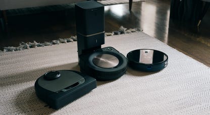
Grab the Roborock Revo Q Robot Vacuum and Mop for $200 Less Right Now
21 minutes ago
Best iPad Deals: Save on iPad Air, iPad Mini and More Ahead of 2024 Refreshes
23 minutes ago
These Top-Reviewed Waterproof Wireless Headphones by Anker Are $30 Off
35 minutes ago
One Day With the Rabbit R1: How I've Been Using It So Far
38 minutes ago
Best Gifts Under $200 for 2024
59 minutes ago
Best Internet Providers in Naperville, Illinois
1 hour ago
Brighton vs. Man City Livestream: How to Watch English Premier League Soccer From Anywhere
1 hour ago
Best Gaming Gifts for 2024
1 hour ago
iPad 2024: What to Expect May 7, and What I Want Next
1 hour ago
Best Windows Laptop for 2024
1 hour ago
Best Savings Rates Today -- Now's the Time to Take Advantage of APYs up to 5.55%, April 25, 2024
1 hour ago
Best CD Rates Today -- Don't Sleep on APYs as High as 5.35%, April 25, 2024
1 hour ago
Don't Wait, Score 55% Off a Pair of Beats Solo 3 Headphones Today
1 hour ago
How Much Can You Earn by Depositing $10,000 Into a CD?
1 hour agoMore to Explore
Reviews, advice and more from CNET's experts.


Get the best price on everything CNET Shopping helps you get the best prices on your favorite products. Get promo codes and discounts with a single click.
Add to Chrome - it's free!
Our Expertise
Expertise Lindsey Turrentine is executive vice president for content and audience. She has helped shape digital media since digital media was born.
0357911176
02468104
024681024
Featured in
Tech


Upgrade your inbox
Get CNET Insider
From talking fridges to iPhones, our experts are here to help make the world a little less complicated.
Featured in
Money


Crossing the Broadband Divide
Millions of Americans lack access to high-speed internet. Here's how to fix that.


Featured in
Energy and Utilities


Deep Dives
Immerse yourself in our in-depth stories.


Get the best price on everything CNET Shopping helps you get the best prices on your favorite products. Get promo codes and discounts with a single click.
Add to Chrome - it's free!
Featured in
Internet


Sleep Through the Night
Get the best sleep of your life with our expert tips.


Get the best price on everything CNET Shopping helps you get the best prices on your favorite products. Get promo codes and discounts with a single click.
Add to Chrome - it's free!
Tech Tips
Get the most out of your phone with this expert advice.


Get the best price on everything CNET Shopping helps you get the best prices on your favorite products. Get promo codes and discounts with a single click.
Add to Chrome - it's free!

Featured in
Home


Living Off Grid
CNET's Eric Mack has lived off the grid for over three years. Here's what he learned.